The restaurant logo echoes the interior. It combines its textures and chopped typography.
The key shaping element is the massive abbreviation “GT”.
The irregular geometric figure adds "games" with the guests of the restaurant, hints at the workshop theme, confuses time and space, and the linearity of the sign refers to a luminous neon tube, a kind of "lava" passing through the entire interior space.
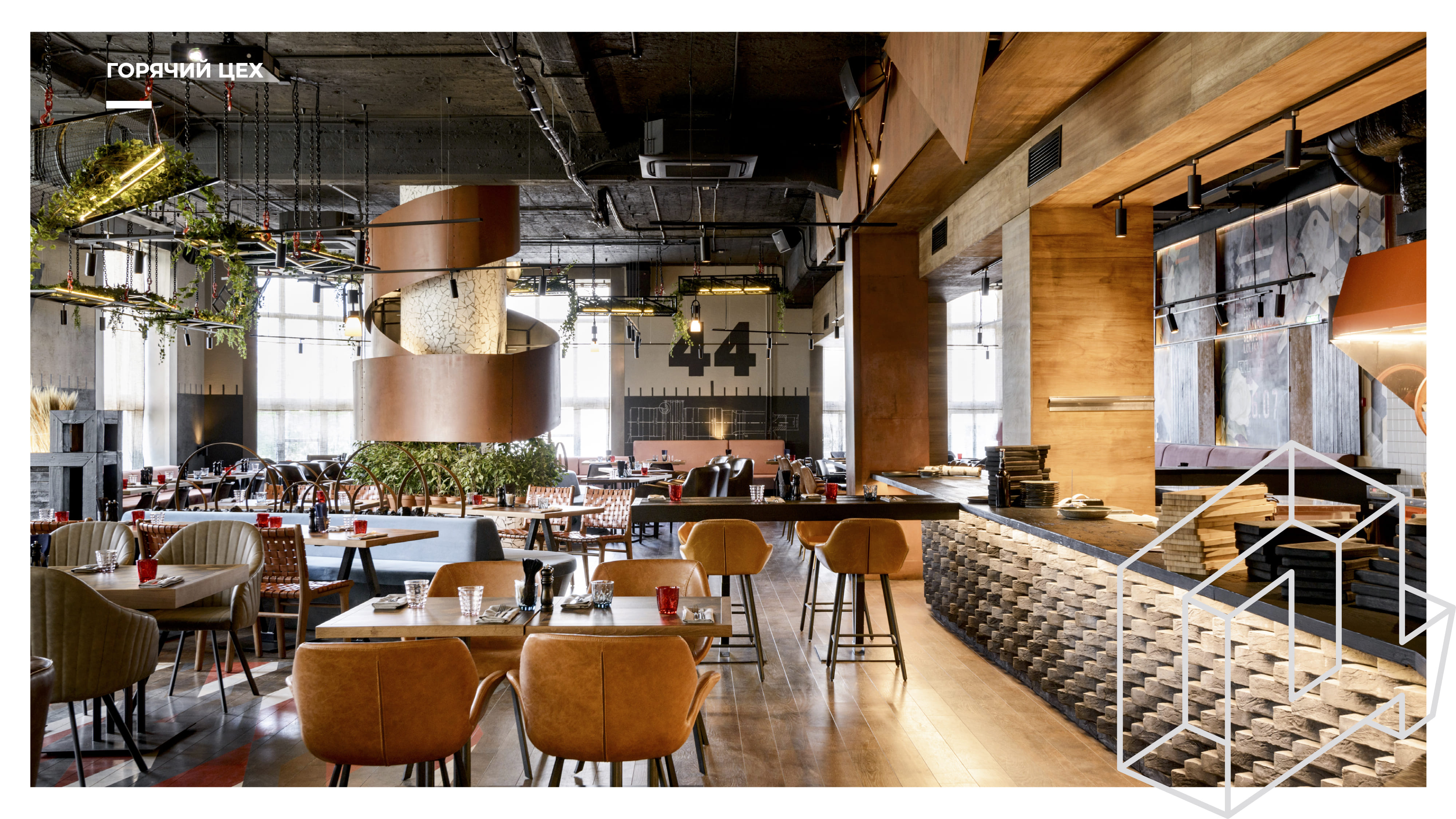
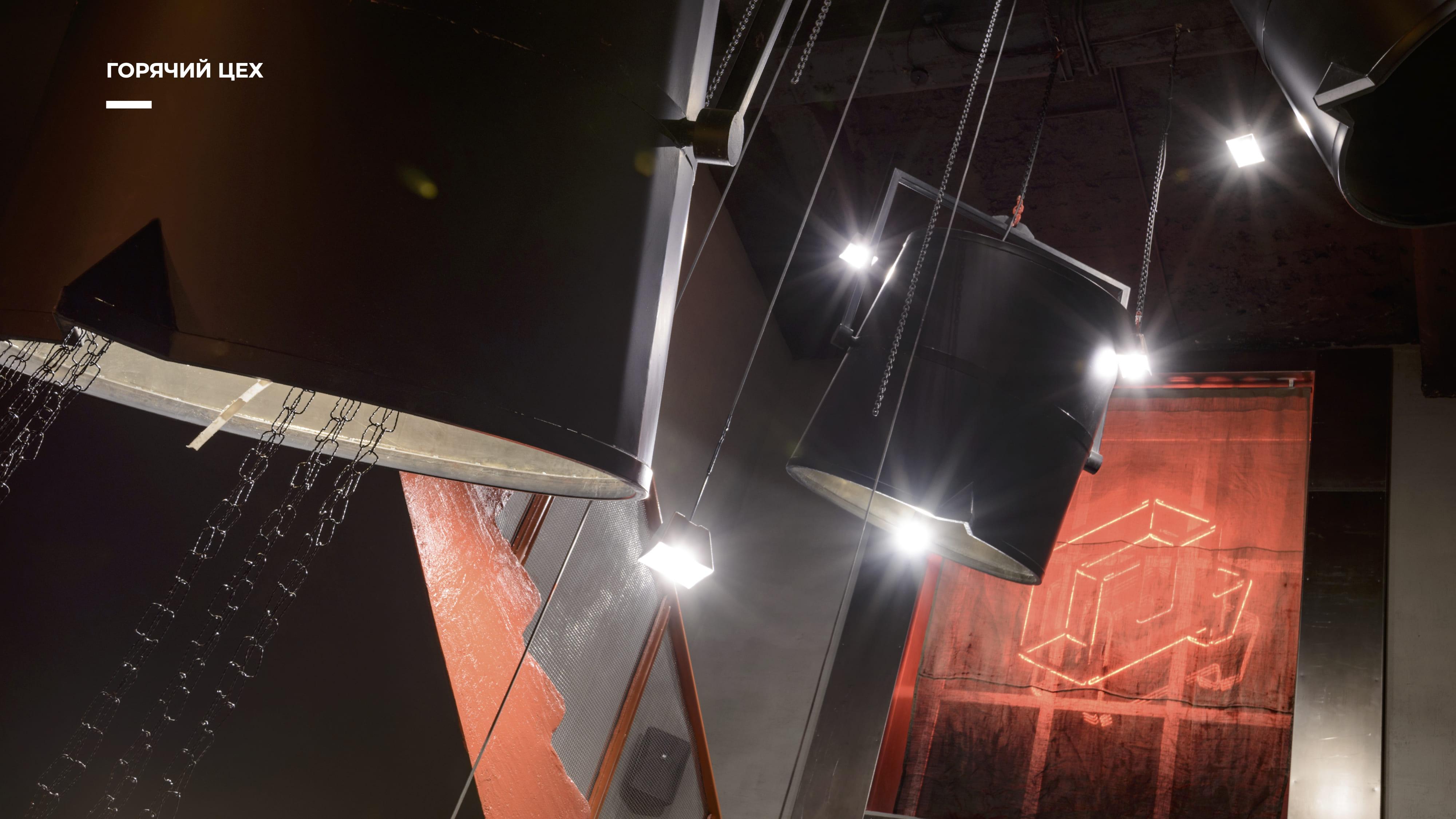
Warm colors to keep food warm in an open fire restaurant. The whole restaurant is like hot, red-hot.
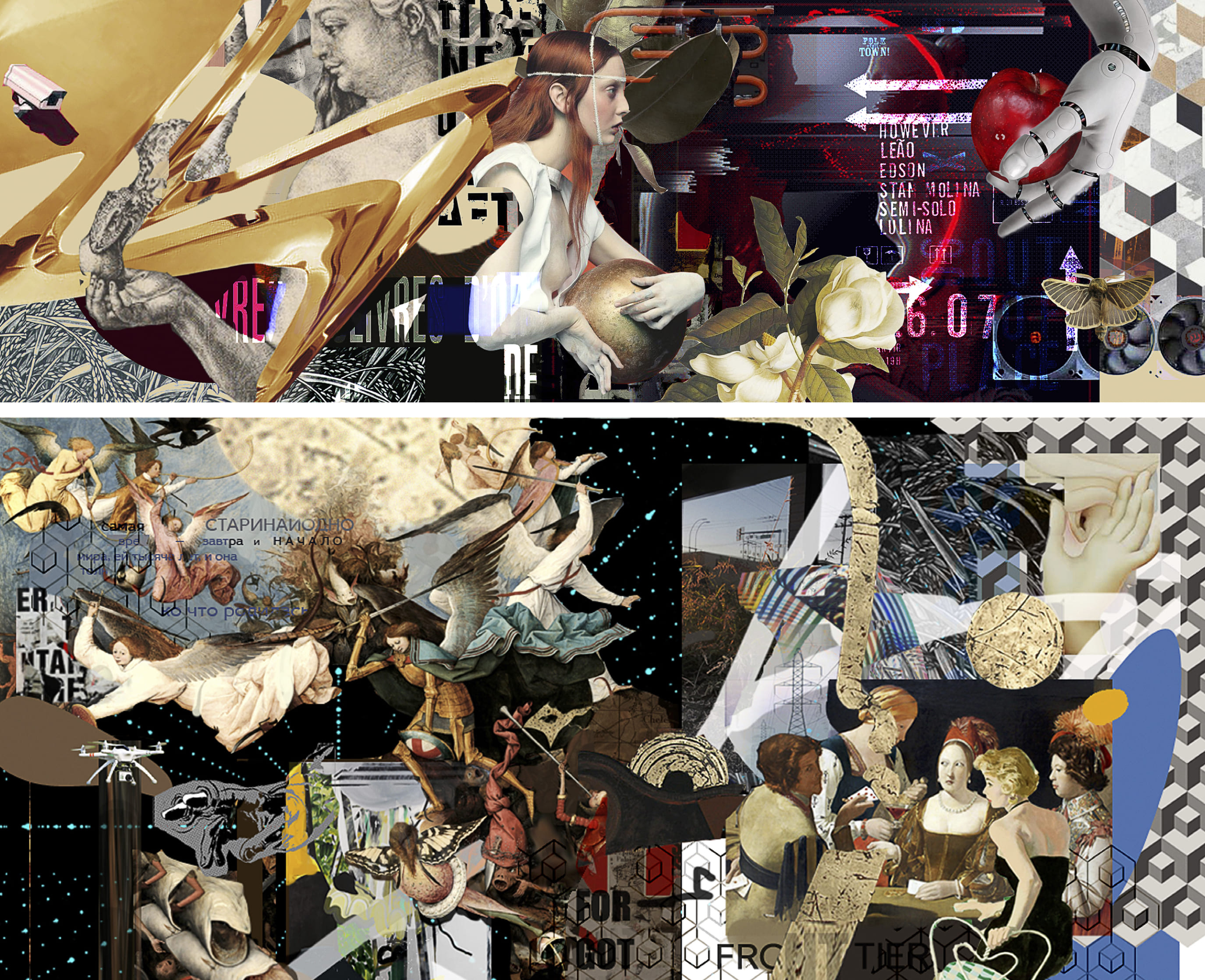
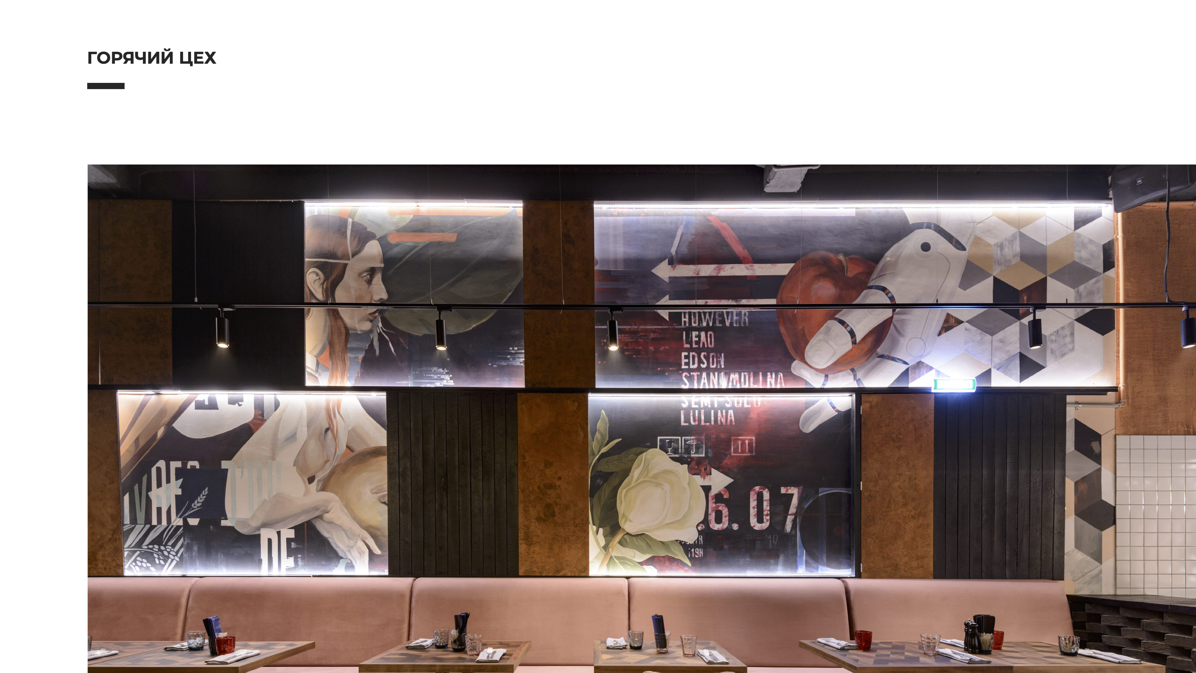
Collage paintings have been developed for the restaurant's interior, supporting the general timeless concept.
The symbiosis of technology and antiquity disorients restaurant guests, creating a sense of a place outside of space and time.
Wooden panels on top of the paintings, opening and closing different parts of it, give a reason to think and put together a kind of semantic puzzle.
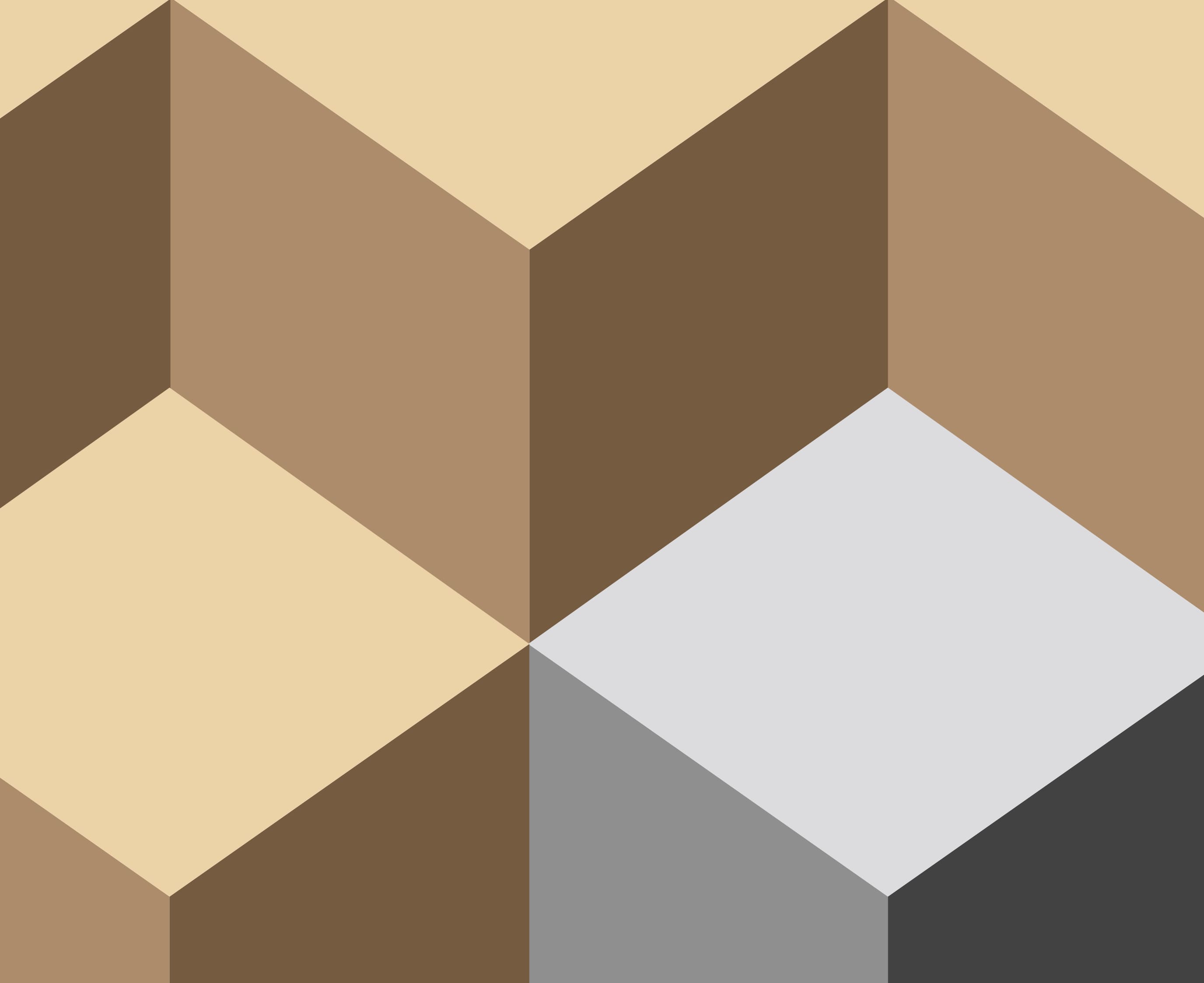
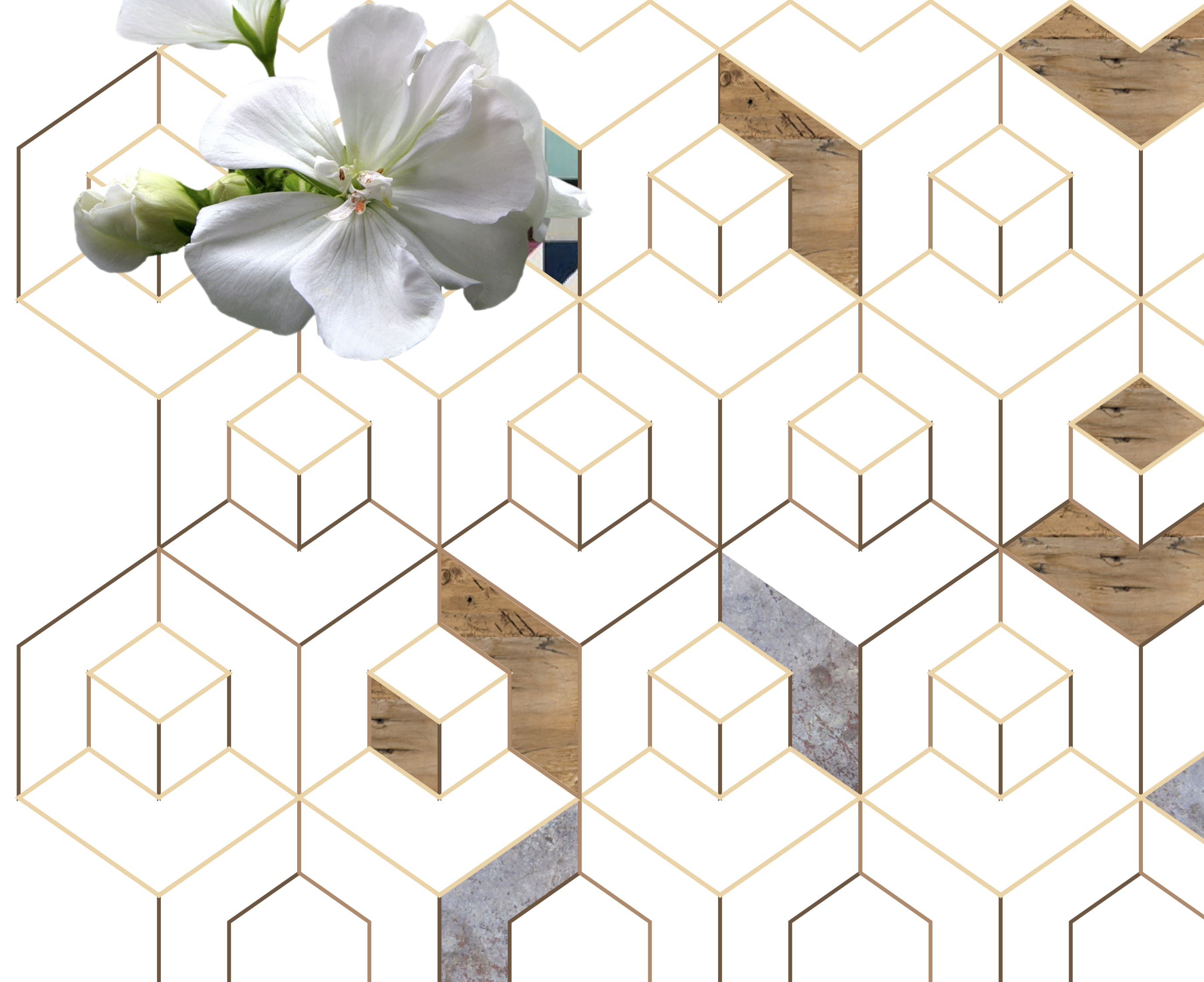
Volumetric letters are a volumetric pattern.
The geometric pattern can also be seen in the paintings, wood countertops and the restaurant logo.
For the architectural and design concept of the "Goriyachiy tsekh" restaurant, see the HORECA section